
CSS
CSS Layout
BOX model
margin collapse
默认增加 pedding and border box会变大
需要添加
1 | *{ |
来固定box size
“*”这个选择器不对伪类生效 如
1 | ::before 和 ::after |
需要添加
1 | *, *::before , *::after{ |
Inline don’t respect the width and height properties. To give them width and height, we need to give them ‘display : inline-block ’ properties
Overflow: when use the border-box, if the there is too much content that the box size is not enough, the overflow can happened
By applying the “overflow : hidden, visible, scroll, auto” to deal with the overflow.
Visible is defult state
Hidden is hide the overflow part
Scroll shows the scroll bar to scroll the content
Auto show the scroll bar only when overflow happends
Auto is short for auto vertial and horizontial
Measurement Units
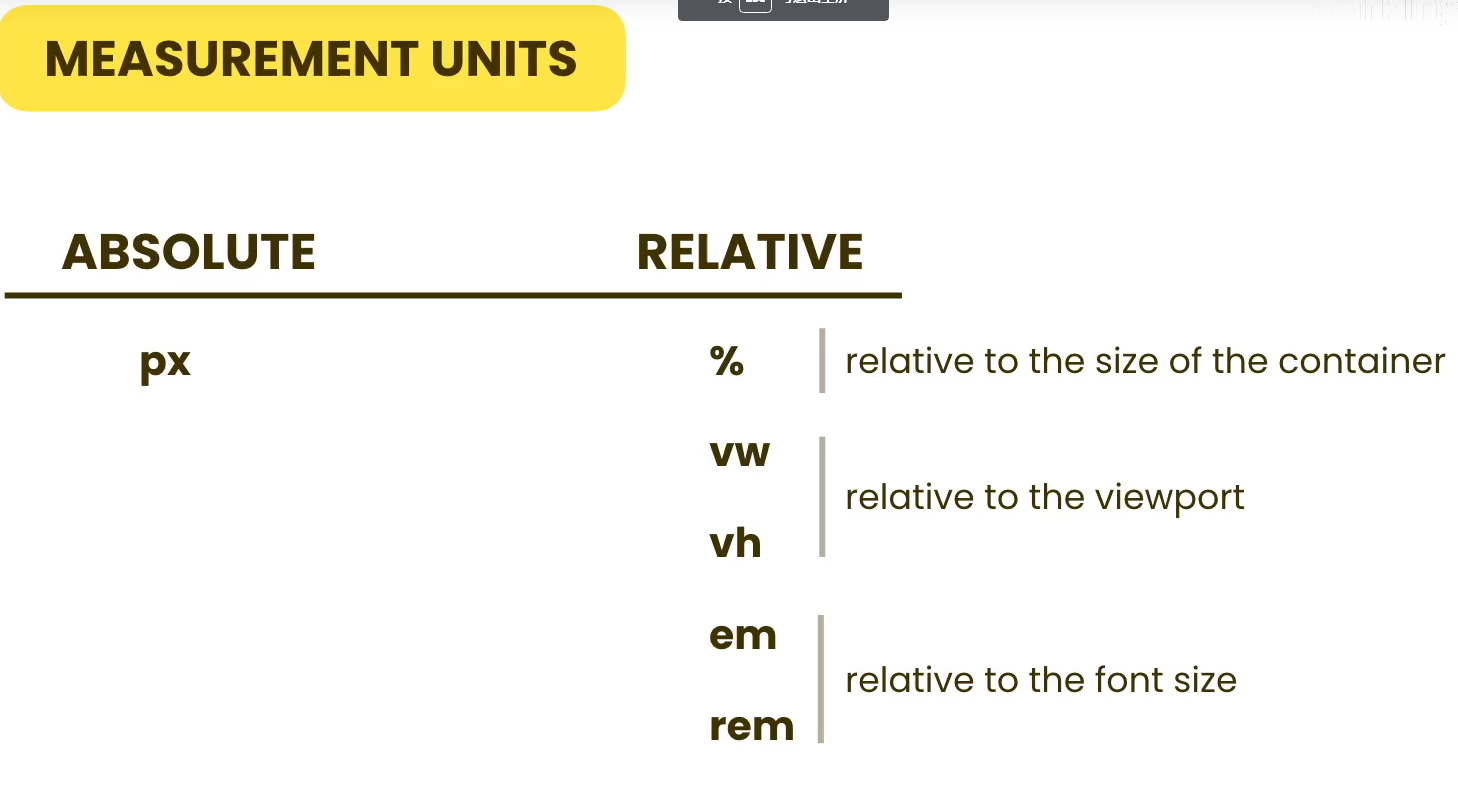
- % 是父级元素大小的百分比
- 注意:body 元素的默认为横向100%, 纵向0px. 只有再有内容的时候, 纵向大小才会拉伸。
- vw 是视野横向大小的百分比
- vh 是视野属向大小的百分比
- em 是元素内font-size大小的倍数
- 10em 为 10倍font size of current element
- 如果当前的element 无 font 属性,则会向父级请求
- HTML 元素 的默认font size 为 16px
- rem 是root element font-size 的倍数 (16px)
Positioning
- Static
- Default state of position
- Relative
- Position relative to the element’s normal position
- Absolute
- Relative to the parent
- the mother element (the container) has to be the relative
- The element with absolute will be removed from the 默认排版
- Fixed
- Relative to the viewport
Flow layout
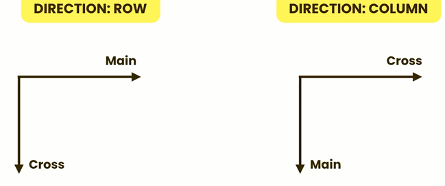
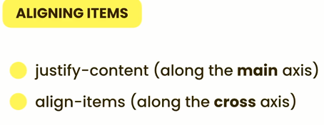
Flexbox

Axises
sizing element (item) for flex
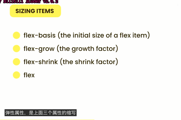
- flex-basis
- If the flex is set to row, flex basis will rewrite the width property. If the flex is set to column, flex basis will rewrite the hight property.
- flex-grow : index
- Flex grow allow the element to grow to fill the 空的 space
- the index represent the how fast it grow. 2 grow twice as fast as
- flex-shrink opposit of flex-grow
- flex : flex-grow flex-basis
- take 1 number and 1 unit
Grid
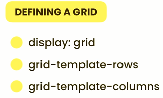
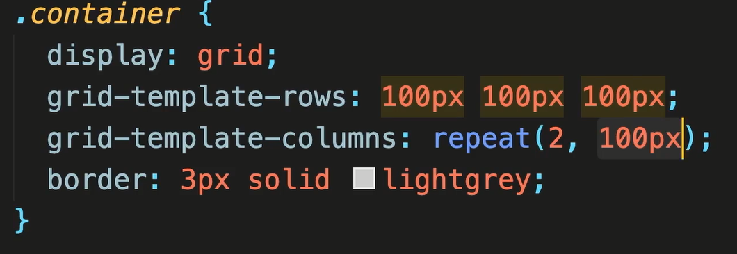
unit “fr” the percentage of the free space
Hiding element
visibility: hidden or none
To ask which device are the user using and to provide different layout, so that the website looks perfect for every devices